European Championships 2018 in Statistics [Updated 23.04.2018]
Note: this article has been updated with a historical overview in statistics for the period 2013-2018. Scroll down for the newly added content.
With the European Championships 2018 behind us, let’s take a look back in statistics!
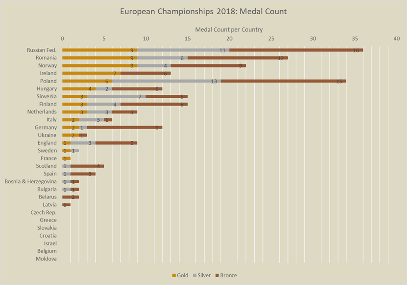
The graph above shows (click to enlarge) all golden, silver and bronze medals per country stacked up. Russia, Romania, Norway and Poland rack up an astonishing amount of medals. While winning the same amount of golden medals, Russia outnumbers Romania and Norway in silver medals. This gets them the top spot in the overall medal ranking.
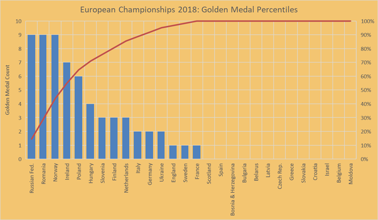
The graph above (click to enlarge) shows the total amount of golden medals per country, relative tot the total golden medals awarded to all countries. The blue bars represent the total of golden medals per country and the red line shows the relative accumulation of golden medals.
As you can see, Russia, Romania, Norway and Ireland won 50% of all golden medals. Hungary and Poland divide 25% of all golden medals between them. And 25% of the remaining golden medals went to the other countries, among them The Netherlands.
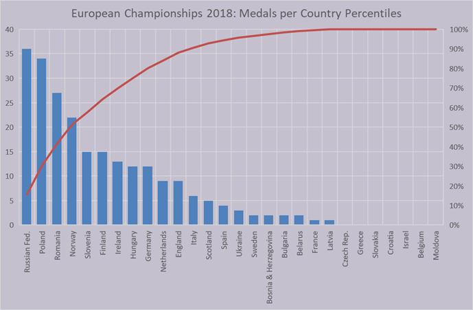
The graph above (click to enlarge) shows the total amount of medals per country, relative to the total medals awarded to all countries. The blue bars represent the total of medals per country and the red line shows the relative accumulation of medals.
Again, Russia, Romania, Norway and Ireland won 50% of all medals. Slovenia, Finland, Ireland and Hungary took the next 25% of all medals awarded. The rest of medals went to the remaining countries, The Netherlands among them.
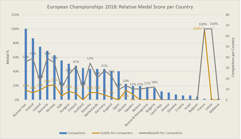
The graph above (click to enlarge) shows all competing countries from the largest amount of competitors to the smallest (blue bars). The golden line shows the relative amount of golden medals they won (e.g. The Netherlands had 29 competitors, of which 10% won a golden medal). The grey line shows the relative amount of medals they won (e.g. on average 31% of Dutch competitors came back with a medal).
Fun facts: Norway had the highest relative golden medal score of the larger teams: 21%. Poland and Romania share the top relative medal score: 59%. France had a 100% golden medal score and 100% medal score, but had 1 competitor.
So how did we do compared to previous European Championships? The public statics are available back to 2013, so here we go…
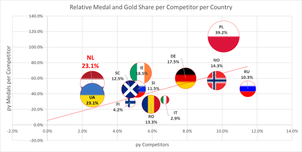
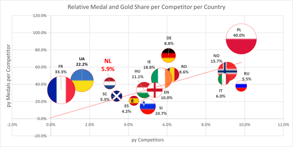
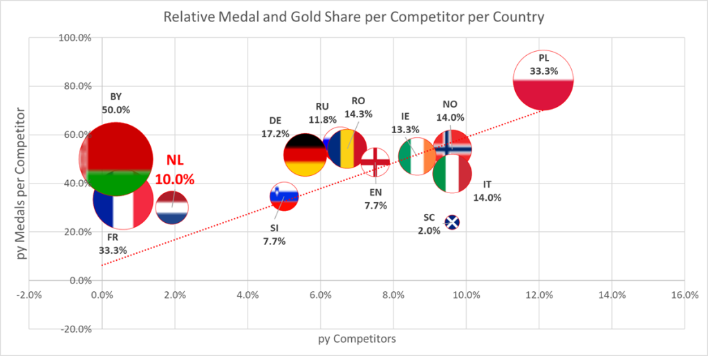
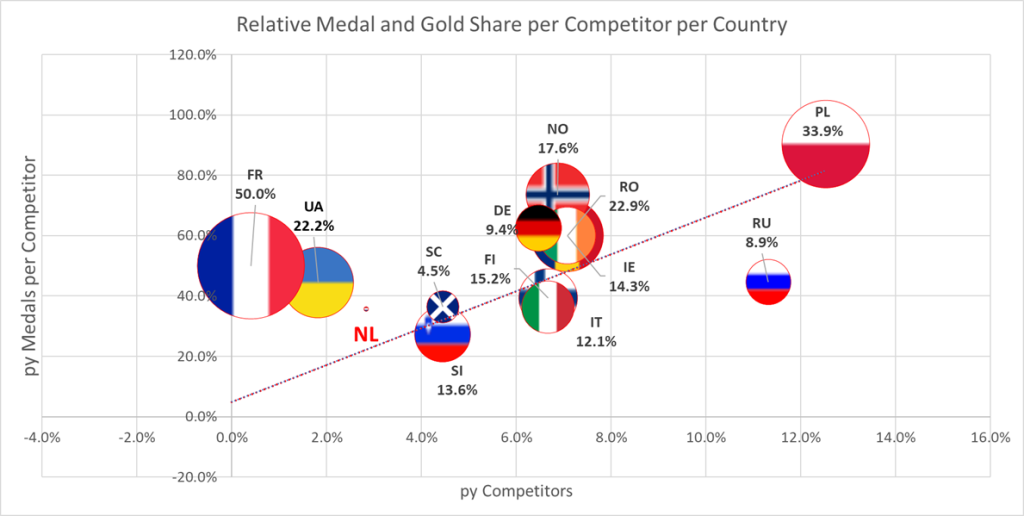
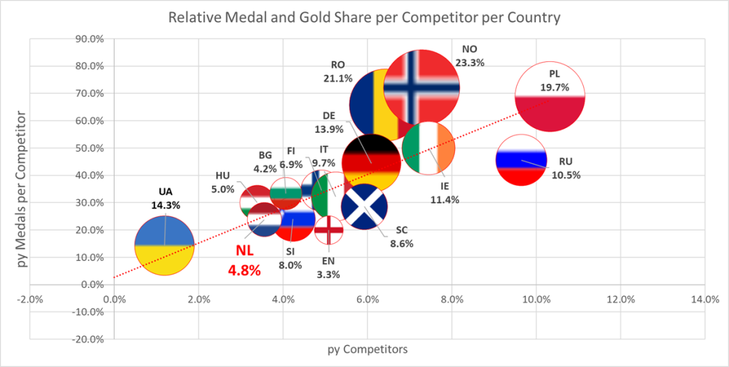
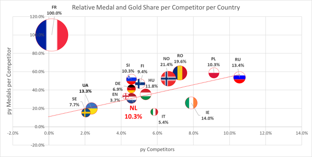
In the graphs below (click to enlarge), the relative proportion of medals per competitor per country (vertical axis) is set out against the relative proportion of competitors per country (horizontal axis). The bubble size represents the relative amount of golden medals per competitor per country. This percentage is also stated between brackets below the country code, e.g. “NL 7.9%”, which means 7.9% of the Dutch competitors brought back a golden medal. Countries without golden medals are not shown in the graphs (except for the Netherlands).
2013 A good year for the Netherlands. With a 2.6% of the competitors that year, 53.8% of them scored a medal, with an average of 23.1% golden medals per competitor. The Netherlands outperformed many countries, like Ireland, Germany, Russia and Norway.
The red dotted trend line represents what you might expect: the bigger the country’s representation, the more medals. Countries that are far above the line performed above average. Countries below the line were performing below expectations based on their relative delegation size. And countries on the line performed as you might expect. The Netherlands is far above the line!
Also, we get a hint of the competitiveness of the tournament: the more bubbles are spread around the trend line, the more it indicates there were a handful of countries that gobbled up most of the medals. Vice versa: the closer the bubbles to the trend line, the more it indicates a competitive tournament in terms of a level playing field.
The bubble size shows the average golden medal score per competitor. Poland looks like Jupiter: their competitors brought back at least twice as many golden medals per competitor.
2014 With 3% of the competitors, The Netherlands’ performance declined a bit relative to the previous year: 41.2% of our competitors made it to the stage and 5.9% came back with gold. We gravitated more towards the trend, yet still very well above it. This year was also a more competitive year than 2013: the bubbles are much closer to the average. The supremacy of Poland is still clearly visible.
2015 A small Dutch delegation this year of 1.9%, 30% of our competitors took home medals, 10% gold per competitor. The competitiveness was about the same as 2014. Poland still performing above the trend, yet closer to the center.
2016 Back with a proportion of 2.8% of the competitors, we didn’t get to that nr. 1 spot, but managed to do a bit better then 2015 in terms of the relative amount of medals per competitor (35.7%), which is till a good amount above the trend. Looking at the spread, 2016 was about as competitive as 2013, less then the previous two years 2015 and 2014. Poland is still racking up far more golden medals then the other countries (outlier is France, but with a very small amount of competitors), and is yet again closer to the trend.
2017 The most competitive European Championship of the 2013-2018 period. Poland is feeling the competition. Romania and Norway coming on strong as the only countries that significantly performed above average. The Netherlands is forced back into the middle, along with many other countries. With 3.6% of the represented competitors, 23.8% of our competitors brought back medals (slightly below the trend), 4.8% of them brought back gold.
2018 The Dutch make up the biggest piece of the competitor pie in our 2013-2018 period: with 4.6% of the competitors, our competitors rack up an average of 31% medals per competitor, and 10.3% gold per competitor, comparable to 2015. We’re hanging around the trend among a cluster of middle sized countries, that’s made up of pretty much the same countries as 2017. Yet, save for Hungary, the all outperform the trend. This year is the least competitive year of the five years we looked at. Again, Norway and Romania are outperforming many countries. Poland seems to be rising again, relatively. Slovenia is back at their performance level of 2013 after a long period of lingering in the average to below average region. Finland jumps out for the first time.
Conclusion What to make of all this? What is our outlook? Short answer: you never know… We do know we have shown the ability to outperform bigger countries, relatively. We do know there’s work to be done if we want to break out from the middle cluster. We do know lots of changes have occurred, both internally and externally. We do know we see lots of potential in our current group – and generations to come. So, back to work and see you in Inzell!
Hope you enjoyed these stats 🙂


